Howdy there! Welcome to the page on all of my Pixel Art Pieces!
My bread-and-butter is doing cityscapes, but I’m slowly branching out into other styles and focuses, as you’ll see with some art that I’ve made for a tabletop game, and more!
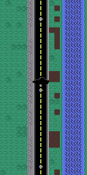
Cityscapes – The Watchers:
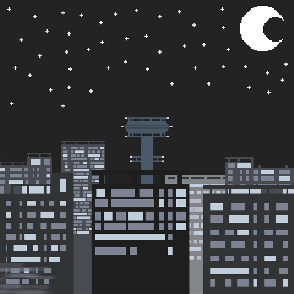


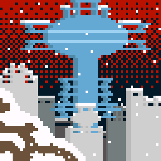
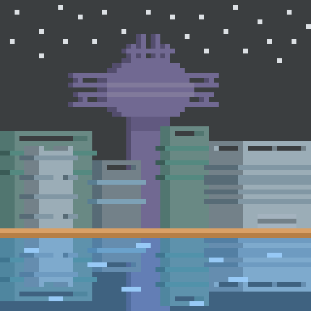
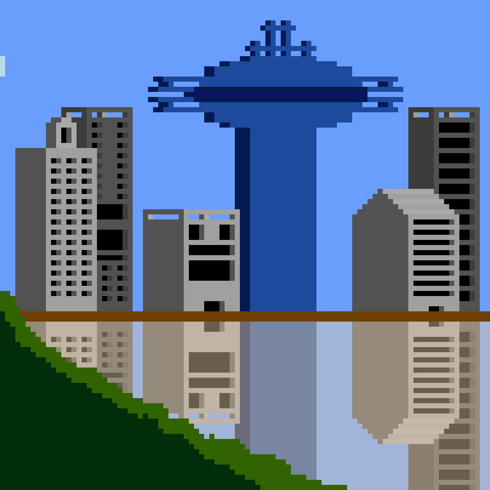
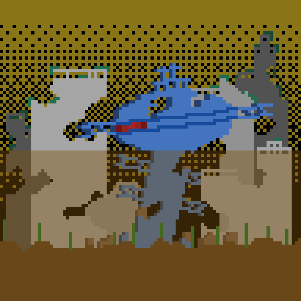
These are all of the cityscapes that I have made under the banner of The Watchers; a name given to me by a friend when we were brainstorming on what to call this series of peices.
I should mention that I made one other cityscape piece before these five, but that was before I had a paid license for Aesprite, the program I use for pixel art, so I don’t have the project file, sadly.
When it comes to my cityscapes, I always like to tell some sort of story with the environment that I’m creating. In this case, I like to think that all of these cities are a part of the same world; a world wherein these ominous watchtowers loom over the tallest of skyscrapers with a glowing red eye that scans the area for signs of trouble. Additionally, if there were to be a timeline for this fictional world, the forth and nineth pieces (that looks to be in total ruin) would be at the very end of the timeline.
Refresh-Mon Assets
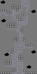
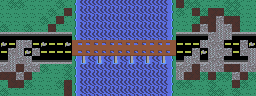
Tilesets


These are the primary tilesets I created to be used for designing the various towns, pathways, and other graphical elements that went into my recently released tabletop/booklet game “Refresh-Mon.”
Maps
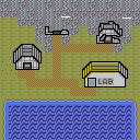
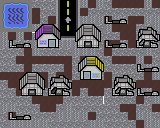
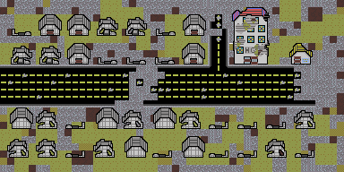
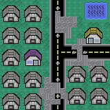
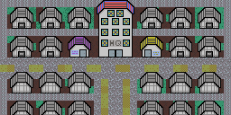
These are the maps that I created using the aforementioned tilesets. Overall, I’m pretty pleased with how these came out, and how they all come together to help convey the overal design philosophy for the fictional region this game is set in.
Game Mockups
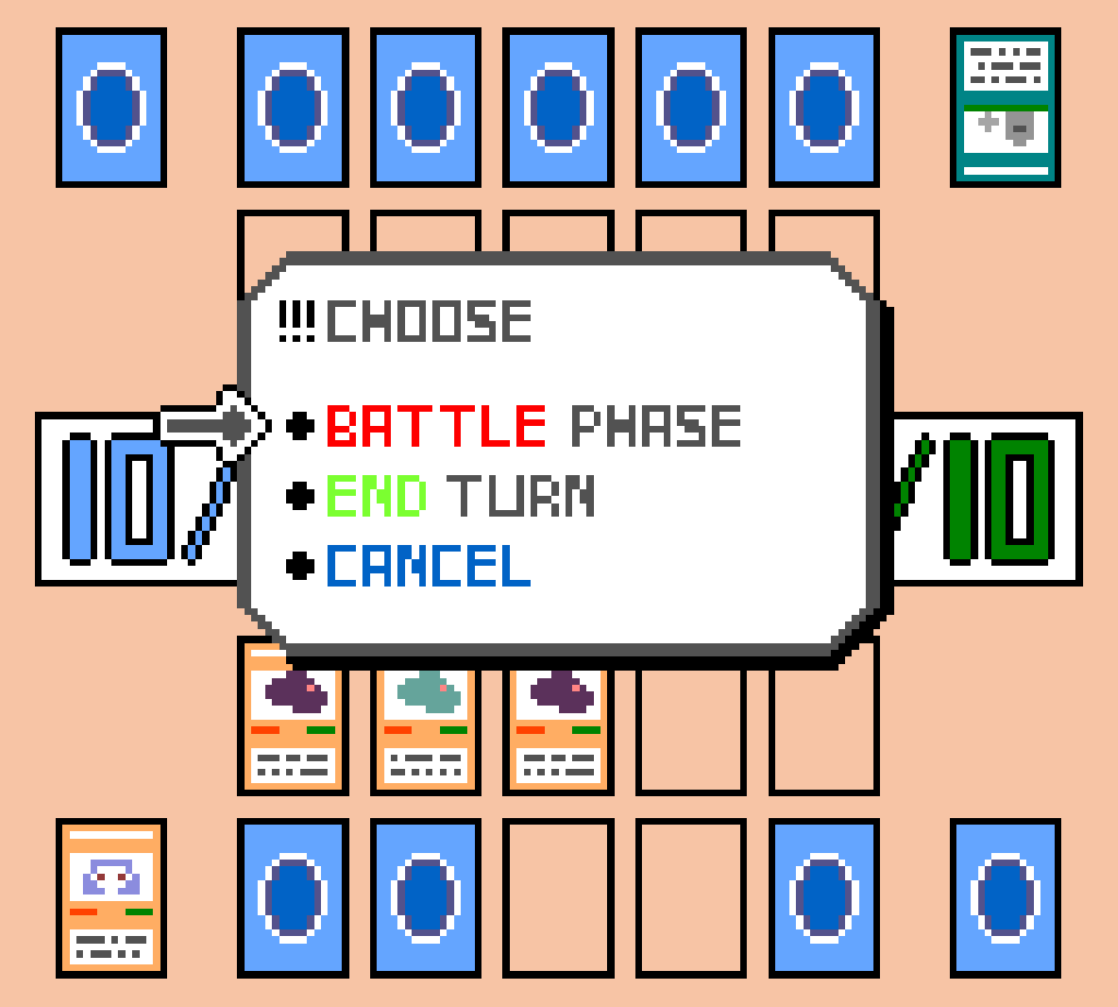
This piece is a mockup of what a text-based sci-fi RPG might look like with the pico-8 palette. Some interesting details about this mockup is that not only does it use the pico-8 palette, but the original size is 120×120, which is the maximum screen size a game can be if made for the pico-8 fantasy console. I took what I learned from a random text-box study that used this same palette to make the lettering.
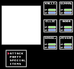
Similar to the above text-based mockup, I decided to do another video game mockup, but with different limitations. This piece utilizes a base canvas of 160×144 and a very restrictive set of colors, which were both limitations of the Game Boy Color. In the fact, the palette I used is simply called the Game Boy Color Type 1 palette.
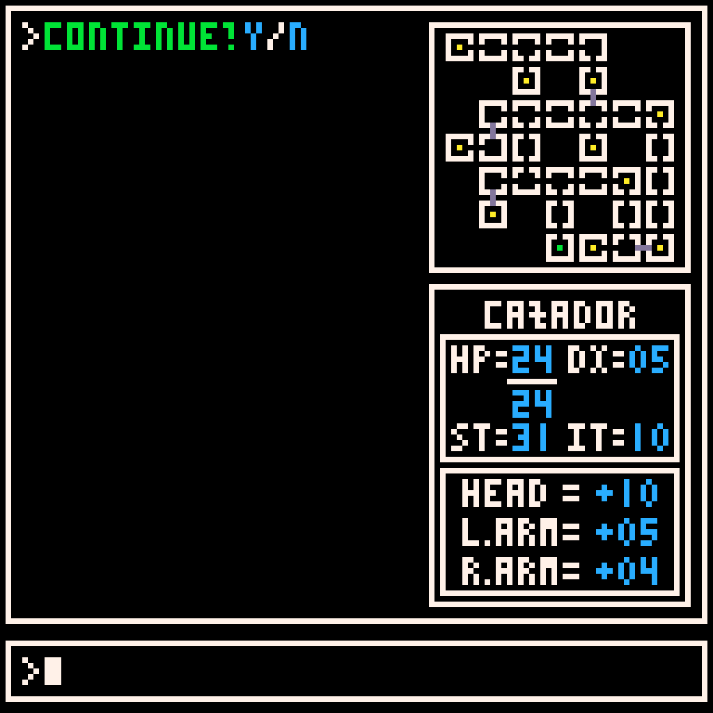
This mockup was made with the limitations of the NES in mind. There were a small handful of these first-person-perspective dungeon crawlers on the system, so I based my design off of those and the navigating of menus off of the classic NES era Final Fantasy games.
Character Designs and Studies

For fans of the old-school Fire Emblem games, this sprite might look familiar. This was a character study I did of the Knight unit from the NES Fire Emblem game. It was somewhat difficult analyzing such a small sprite, but a lot was learned from studying the overal design of the Knight.
Some time after making the aforementioned Knight from Fire Emblem study, I decided to try and apply what I learned to an original design. While I’m not 100% satisified with the design of the lower half of this mech, the overal design and palette come together wonderfully.
Misc. Art Pieces
Pixel Dailies Prompts
As of right now, I’ve only made one piece following a Pixel Dailies prompt. The prompt for this piece was “Door Way.” It took a couple of attempts, but I’m happy with how this piece turned out.
One-Off Pieces
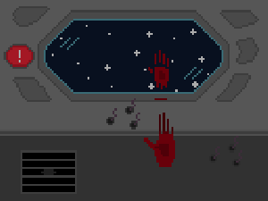
This piece was partially, if not entirely, inspired by a piece that a friend made. I really like the moving stars in the background of their animation, and I also referred to my previous animation for further ideas. Eventually, I created this animation of a ship tumbling out in space.
This was a simple text-box test utilizing the pico-8 color palette, as seen above with the text-based RPG mockup. I knew I wanted to eventually try to make a text-based RPG using the pico-8 fantasy console, but I also wanted to get a feel for what that palette might be like. I’ve been told that the text is surprisingly easy to read despite no letter being no more than 3×5.
